Last update: June 2017
Before buying, people compare. Before comparing, people judge.
Every webmaster wants to know “how to make a website sell more”, with 60+ hours of research and 12+ years of experience in online marketing area, FATbit has compiled this 101 actionable points to help you in engaging visitors, improving sales, and making the right impact. You should definitely diagnose your website against these 101 points. Enjoy the post… ![]()
On coming across a website for the first time, online users skim through it quickly, and if it doesn’t meet their expectations, it is abandoned within seconds. If losing your treasured customers due to this haste of seconds is your biggest nightmare then learn about the tips to make your website sell and play safer with FATbit expert’s recommendations.
Your unique product or service will get a chance to impress only if website leaves a positive impression. It seems unfair but unless you are a big name or the only supplier of the product/service, you will be judged by your website. And visitors judge whether your website is worth their time or not in just a few seconds.
So this post will teach you how to impress your visitors and generate more leads. The points that roll in this list will equip you with the jargon of optimizing website to improve sales and increase online visibility. All you need to do is making an action in the given direction for witnessing a notable change in your conversions.
First Impression should always be right
1. Organized website structure which includes a well-planned homepage as well as unique and custom design. A minimalist design without distracting backgrounds ensures the information reaches visitors seamlessly.
2. Other than going for readily available templates, go for a custom design that offers you a unique and distinctive look.

3. Adopt color psychology which aids in increasing the conversion rate of an online business.
4. Modular layouts that let content shine have the biggest impact on visitors.
5. Have a consistent style across your website. This makes it easy for the visitor to get accustomed to your website design.
Give Delightful Experience to Your Visitors with a Meticulous Website Design
6. Header sliders are a thing of the past. Nowadays it is prefered to use illustration in header, 360 degree videos, animations and gifs which tell a story.
7. Use favicon and logo on every page of your website.
8. These days screen sizes vary across platforms, therefore it is advised to adopt a responsive design for your website.

Also Read: 10 super tips to build a user friendly mobile website
9. A hero image is an ideal solution to immediately arrest a visitor’s attention and entice them to explore your site further.
10. Do not over stuff your website with content and graphics. Use a minimalist design and lighten up your website.
11. Avoid using unnecessary popups as they hinder user experience. Use them effectively. Check this post to find out more.

12. Ensure there are no spelling mistakes, typographical errors, spacing or alignment issues.
13. Website loading speed should always be kept in check. If your website is slow to load then it will not only decrease user’s interest in your website, but also affect your search engine rankings.
14. Picking up appropriate keywords will help reduce bounce rate as only relevant traffic will visit your landing page.
15. Restrict amount of information you display on the homepage and just highlight details like logo, tagline, services offered and USP.
16. Use scalable vector graphics (SVGs) for responsive website.
17. Use skeleton screens to improve speed of the UX.
18. Never use a splash screen for a website. It is only useful for mobile apps.
19. Do not use a registration or subscription popup at the doorstep of your website.

20. Auto-play audio and video are not recommended for a website.
21. Separate advertisement from main content.
22. Do not display information on your website that is not yet available. Seeing a “Coming Soon” or “Under Construction” is not advisable.
23. Ensure there are no 404 errors, broken image links and resolve any form of technical issue.
24. Conduct cross browser testing and screen resolution testing before making any webpage live.
25. Replace your stock images as it prominently screams that “we are fake”. Put more authentic images instead or use a combination of stock and custom photography.
User Friendly Architecture
26. If you publish large amount of content on a regular basis, then it is advised to use page hierarchy to organize your content. This helps users to find the content more easily.
27. In the menu bar, you should a mega menu with responsive sub navigation menu.
28. Make sure that your website is easy to navigate and users can find the relevant information without any hassle.

29. You can use a vertical dot navigation styles and one page scrolls.
30. Do not waste your header image just to look pretty. Offer a CTA or link the image to an inner page.
31. Make sure that you always use breadcrumbs for navigation.
32. Offer the main value proposition within the first fold of your web page as 80% of users spend their time looking at the information above the page fold.

33. Provide a glimpse to the user that there is something below the first fold too, so that the visitor scrolls down and views the remaining content.
34. If you cater to a global user base speaking different languages, ensure that your website has options to be translated as per the target audience.
35. Instead of using old CAPTCHAs, get creative by using latest CAPTCHA trends which can be fun for your website visitors. This includes word and math solution, drag and drop, JQuery slider, etc.
36. Add a sitemap in the footer and sitesearch option at the top.
37. Always ensure that the external links do not open in the same window.
38. Provide acknowledgement to the user after any type of successful conversion.

39. Keep the branding consistent throughout the website, like same font, color scheme and layout pattern.
40. Prefer pagination over infinite scrolling.
41. Design your website in accordance to user expectation, like clicking on website logo takes user to homepage.
42. Make sure that the functionality of the back button is consistent across your website and does not break the navigation.
43. Avoid automatic refresh of the content when the user is viewing a dynamic page. You can place a notification stating new content is available.
Conversion Path Optimization
44. Value based exits – Offer more value when a visitor is trying to exit midway.
45. Focus more on enticing CTAs. Ensure that it creates anxiety and urgency, solves some problem and compels someone to stay on the website.

Must Read: How to create best CTAs that create more leads and sales
46. Use contrasting colors for call to action buttons and test different shades to determine what works best for your website.
47. Include content and media that is persuasive.
48. Always keep your main heading and text towards top left corner and your call to action towards bottom right
49. The checkout process ought to include minimum steps and minimal forms
50. If a user has left some conversion critical action midway to browse some other page, offer them a reminder to complete the process, but do not pester them.
51. Use arrows on your page as a directional cue to boost conversion
52. Always do a follow up on a user who left a process midway.
53. To control cart abandonment you can also offer deals on products added to the cart.
54. At the time of the checkout show the images of the product in cart.
55. Feature most selling and popular products on home page.

56. Your landing page should be dedicated to a single cause and should not have any outbound links.
57. Make your registration process quick, streamlined and hassle free.
58.Pricing Structure should be carefully planned and should not seem overly expensive.
59. The price should be clearly indicated where necessary. You can also create a sense of urgency like limited time offer or n items are left in stock.
60. Ensure that your landing page offers the visitors all that has been promised.
61. Use high quality product images on product page.
62. Remove any form of distraction close to conversion funnel.
Also Read: Tips to increase online sales via conversion funnel optimization
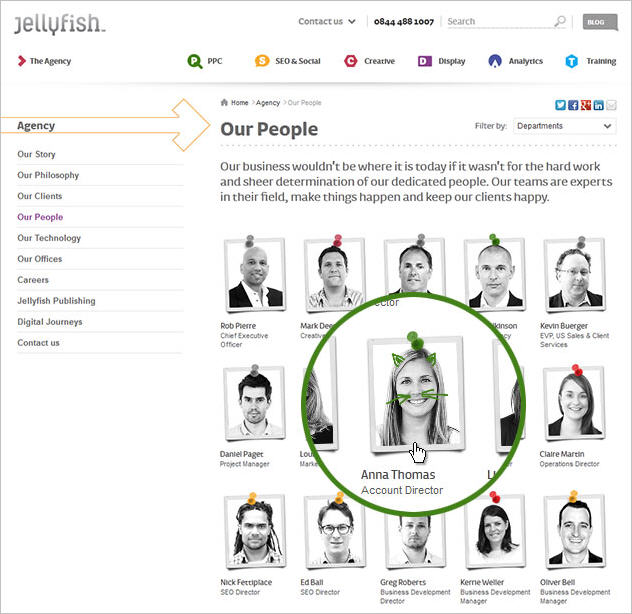
63. Offer recommendations in the form of suggested items or related products.
64. Physical addresses, contact number and tech support details should be clearly visible on contact us page.
User Engagement
65. As more and more web pages are designed with border-to-border artwork in a single-column style, content below the fold is more likely to be missed. Add arrows or other visual cues to encourage scrolling.
66. Principle of Reciprocity– Give away valuable resources related to your industry for free (example: a free eBook, a trial pack, etc.) so that the other person feels indebted and uses your services or refers you to someone else.
67. Have a limited number of tabs in the menu bar and incorporate nesting of menus.
68. Organize Webinars and other online events to discuss latest trends of your industry.
69. Make the content available on your website shareable across social media platforms.
70. Publish a blog on a regular basis to engage users through your content.
Also Read: 7 proven ways to increase conversions and user engagement
71. Stay active on Social Media websites to build a network.
72. Start a newsletter to update your subscribers about any new event, product launch or any useful update.
Give a human feel to your website
73. In the era of Chatbots and artificial intelligence, customers do look forward to get the answer to their questions with a personal touch.
74. Use “About Us” page to introduce mission, values and vision so that the visitors get to know more about your company.
75. Include a list of your employees and their credentials so that the visitors can see who is working behind the scene.
76. Ask your users to leave a feedback or some suggestions.
77. Do not merely list all your offerings in a bunch of bullet points. Properly highlight how your product or service can solve a problem.
78. User prefer to choose you if they like you over the competition. Ensure that you solve their queries in a timely manner, do not charge them unreasonably, and make them feel important.
79. Keep your comments section moderated to avoid spam or irrelevant comments.
Trust building elements
80. Show your availability on various social media platforms. Highlight your accounts on your website.
Also Read: How to increase sales of a business using social media
81. Showcase your company culture to your potential clients.
82. Use guarantees, risk reversal mechanisms for garnering trust.
83. Talk about awards, accolades and recognitions entrusted upon you on your homepage
84. Include case studies/stories of your work with your past clients. Highlight list of your clients, past works in the form of a portfolio, or live demo of a product.
85. Showcase what neutral third parties (authoritative sources like news publishers, influential blogs) have to say about your work.
86. Privacy Policy, Terms and Conditions, contract details, shipping policy, return policy, etc. should be transparent and clearly mentioned on your website.
87. Always highlight why you need a particular information, when requesting it from the visitor.
88. Use testimonials from past customers and place them right before your CTAs. This is highly helpful in increasing conversion rate.
89. Secure your checkout pages and display security icons/signs on them.

Content Relevance and Presentation
90. Have a dedicated page to address user queries and FAQs.
91. Clean the cobwebs on your website. Refresh your look and content from time to time.
92. The content on your website should be original, plagiarism free and should focus on your target audience.
93. Use hand-drawn annotations, which always commands attention.
94. Use visual aids and statistics to support your content.

Also Read: What makes visual content so critical for a website
95. To improve readability, use the same alignment consistently across the page.
96. Use interesting headings, sub-headings, and fonts to draw attention to your content and make it easier for the reader to scan through the page quickly.
97. For an ecommerce website, there ought to be proper visitor and product segmentation.
98. Give your visitors a reason to buy from you via competitive positioning or USP.
99. Clearly tell your customers how you are better than the competition by highlighting the solutions you provide for a given problem.
100. Your webpage should highlight all the information that is crucial to the visitor.
Also Read: 13 sure shot tips to improve E-Commerce Sales and Brand loyalty
101. Highlight a clear breakup of the difference between various packages offered, highlighting which package offers what.

Bonus point
Add fun elements: People remember how you make them feel, if we make them smile by including some fun element on website. They will always remember the website and bounce rate can also be reduced.
With this checklist of 101 actionable points by FATbit, now you definitely know the answer to this mystic question “how to make your website sell “.
We know it has been a long post but there is still one important lesson left. There are various not-so-good-looking websites that are doing great in the web zone. Craiglist surely is a good example. You can check this blog by kissmetrics to check some more.
To stay updated on professional insights and industry best practices, it would be helpful if you subscribe to the following: Conversion-Rate-Experts ConversionXL Marketo Moz FATbit Their blogs are a great resource to learn more about conversion optimization and internet marketing.
For making a lasting impact, it is important to keep in mind visual as well as functional aspects. While undertaking design and development work for our clients, we always keep above points in mind to ensure real business benefit. These tips to make your website sell will certainly save a lot of your time on research and will directly give you a well thought out action plan to implement.
If you have anything to share with us don’t forget to make use of our comments section. Your comments and feedback are valuable to us.
The post 101 Actionable Best Tips: How To Make Your Website Sell appeared first on Best Website Design Company Blog - Results-Driven Web Design.


